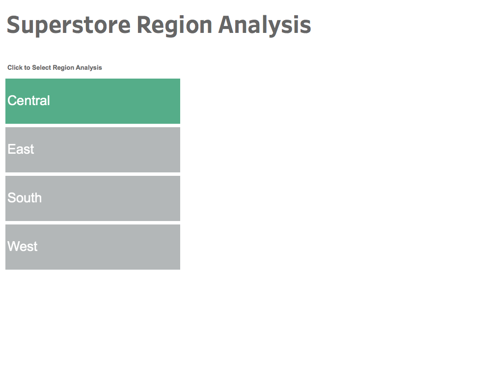
Switch Between Small Multiples and Tile Maps in Tableau
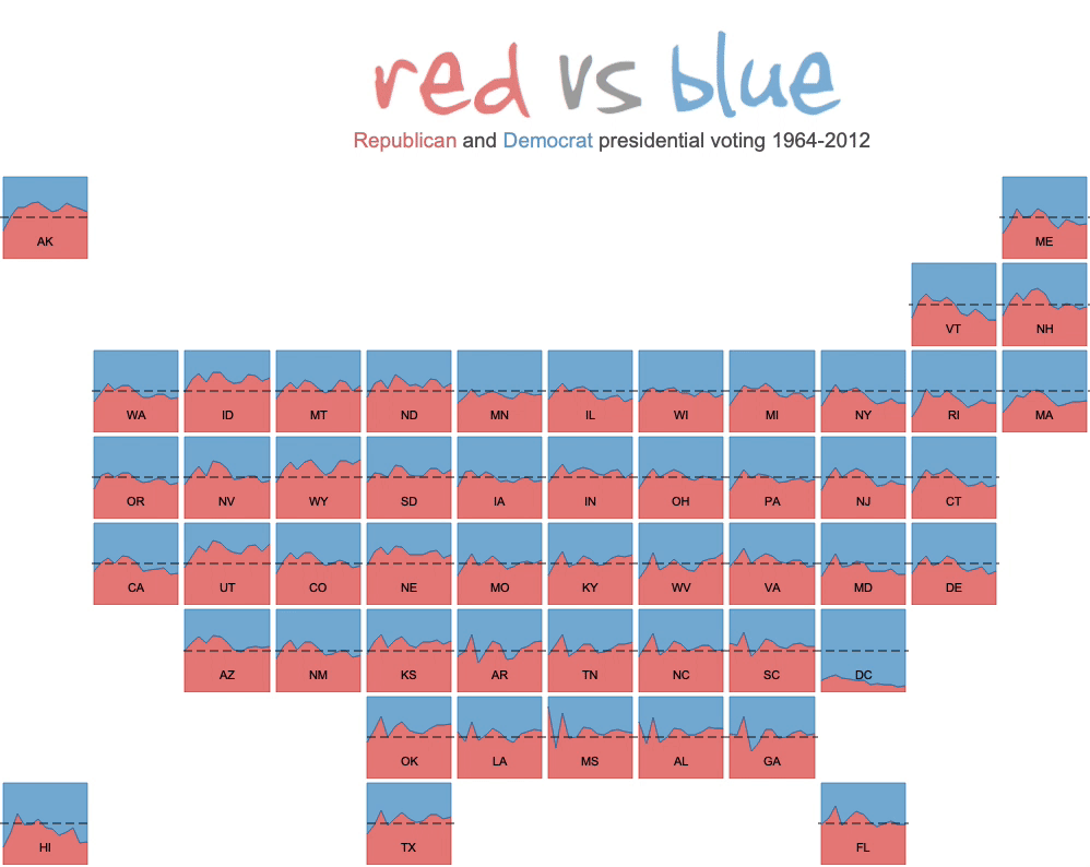
It's been a few years since I've posted a Tableau tutorial (I spent the last three years earning a Ph.D. in Information Design from Clemson University), but with the 2024 election looming, I wanted to showcase how to display both tile maps AND a sorted small multiple view. While tile maps look cool, they are often criticized for representing a pseudo-geography, so I thought it would be nice to allow the user to sort the tiles into alphabetical small multiples as well. This works particularly well with Tableau's default animations.
In a previous post, I showed you how to make a tile map, so you can check the tutorial there. This tutorial assumes you have already built a tile map. My tutorial is probably outdated as joins did not exist in Tableau back then, but you can at least use it to download the workbook.
To create the sorted small multiples, I used two calculations from Andy Kriebel's tutorial on small multiples.
As in Andy's tutorial, we need to create two calculations to sort the tiles:
Column Divider
(index()-1)%(round(sqrt(size())))
Row Divider
int( (index()-1)/(round(sqrt(size()))))
Next, create a parameter that allows the user to select how the tiles are displayed:

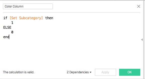
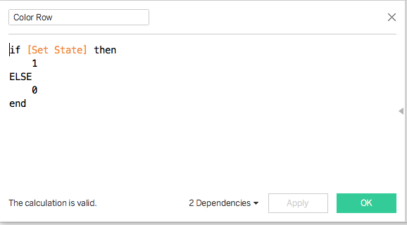
Then, we need to create two calculations to drive how the tiles are displayed (either as tile map or small multiples):
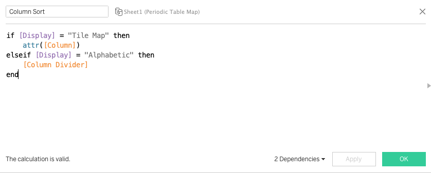
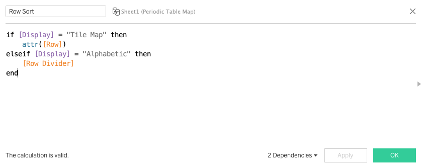
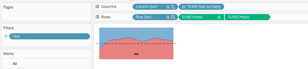
Add these calculations into the view with Column and Row corresponding to each calculation:
Make sure that both calculations are set to Compute Using the dimension you want to sort by. In this case, we are using the State:
Make sure that both calculations are set to Compute Using the dimension you want to sort by. In this case, we are using the State:

Finally, make sure animations are on for the workbook. The animation works great on Tableau Public as well!